When visual artist Bettina Harvey was in the fifth grade, she spent recess cleaning out needles from the roots of conifer trees while her classmates played ball.
She has always had a deep connection with nature and her years of working as a horticulturist, gardener and floral designer for the City of Vancouver now informs her art. “My subjects are always from nature,” she says. “I think it's important to expose people to the beauty of nature. I think people need to see that to connect with it.”
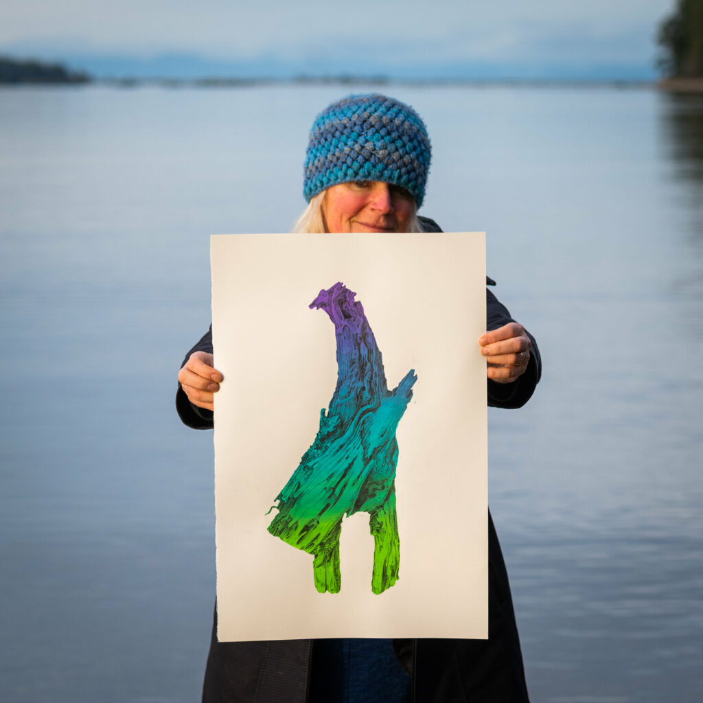
In both Dendrochroma and Mood Rings, she uses drawings of driftwood to invite us to contemplate the impermanence of memory, the changing nature of our emotions, and the experience of aging.
“What I like to do is exhaust a series. I look at different ways of working with a subject,” Bettina explains. “I want people to see driftwood as it is—as part of a tree—but know that it can represent more.”
Dendrochroma and Mood Rings are on display in our Aurizon Atrium until March 4.

In Dendrochroma you use driftwood as a metaphor for the experience of aging. Why did you choose driftwood?
When my father started his journey through dementia, he would go for walks along the beach and pick up these really interesting pieces of driftwood for me as gifts. I couldn’t let go of them so I started drawing them. That’s when I began thinking of them as metaphors for the aging mind.
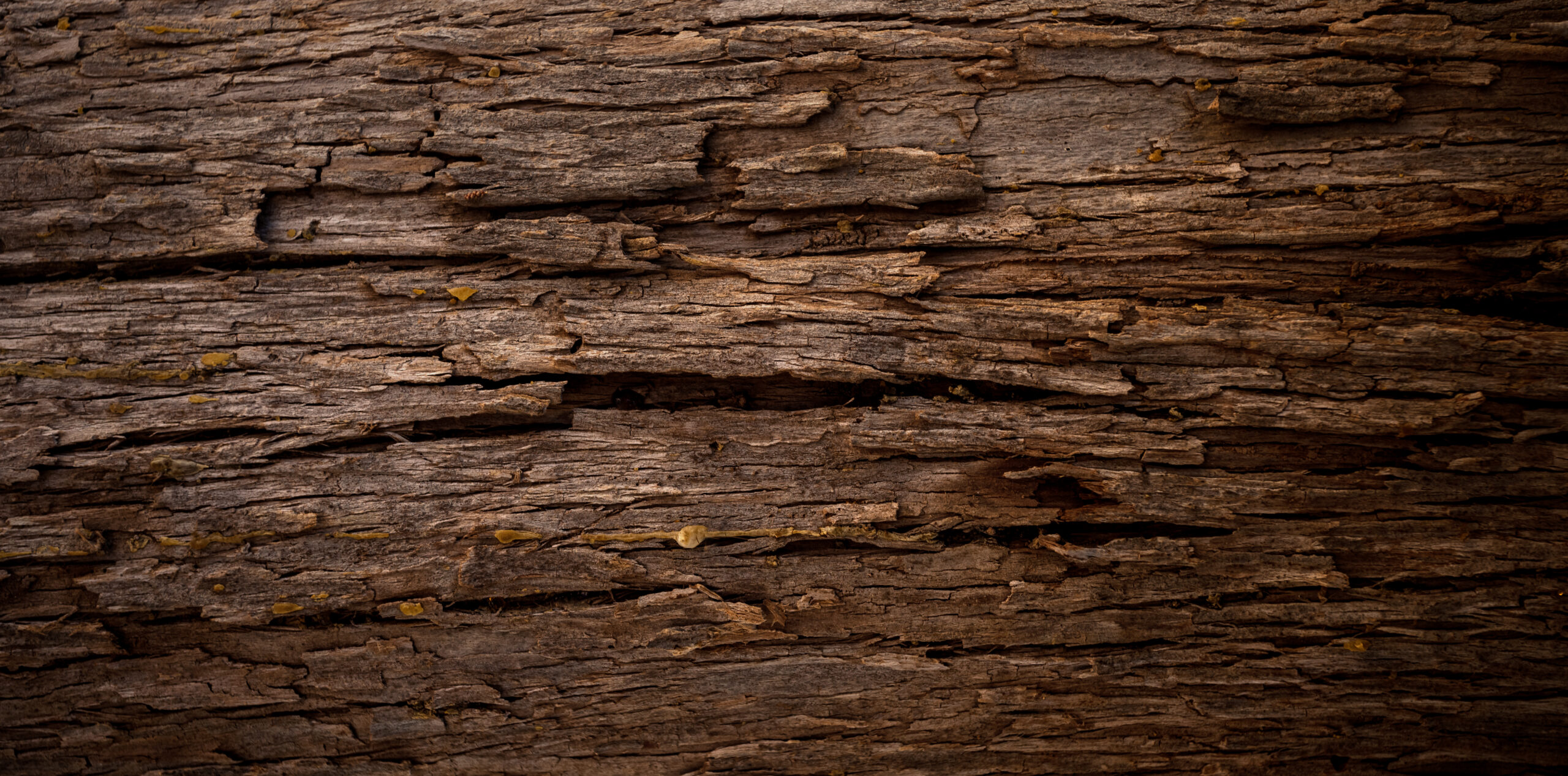
Driftwood is what’s left behind after a tree has fallen and made its way down and through the ocean and washed onto the beach. The pieces of driftwood in Dendrochroma are so unique because they are from tree collars—the point on a tree where the branch attaches to the trunk. The tree has been broken down by the physical mechanisms of erosion as well as different microorganisms and by the time it finally gets to the beach, it’s sort of a facsimile of itself.
Watching a loved one with dementia disappear in front of your eyes is hard, but what I saw in my father was the strength, the creative force that came through as his memory began to fade away.
He used to be an investment broker and when he started to lose the ability to count numbers and remember certain things, his creative side dominated. It was amazing to see. His creativity grew strong and became his essential self. He would carefully select pieces of driftwood; they were like sculptures to him. And he was happy, you know. He was happy in his final months as long as he could walk along the beach and pick up his driftwood.
Mood Rings, like Dendrochroma, has drawings of driftwood but it’s also accompanied by a video where people expressed different emotions based on colours, like an actual mood ring. What inspired the video?
My first memory of colour, my first fascination with colour, was my mood ring. I had one and I wore it all the time. I became absolutely obsessed by it. It's my strongest colour memory. When I started working on this series, I wanted to play with that idea of mood rings and this fascination we have with attributing colour to a certain emotion.
The drawing itself is of one piece of driftwood. I’ve drawn it the same but each drawing in the series has different colour gradients to show that change in appearance depending on the circumstance or time or emotion.
But I really wanted to connect other people to the project. We were in lockdown and people weren't seeing each other with their masks off—they weren't seeing each other period. The video was just a wonderful way of connecting with each other and giving people the freedom to express different emotions.
I think most people have that one posed selfie face but as human beings, our emotions can range and that’s okay. So, what I’ve tried to do is use colour sequences that represent a wide range to show that it’s okay not to feel happy all the time. Representing anxiety and doubt and sadness is just as important as happiness.
What do you hope remains in the minds of people after they see Mood Rings and Dendrochroma?
I have always thought that there should be more of a connection between science and art because growing up that connection was sort of lacking in my own education. I just think if there's any way I can use art, it’s to show the beauty in nature and get people to care a little bit more about our environment.
I want to encourage people to connect with the natural world, see the beauty in it, and think of ways we can protect it. I want people to take another look when they’re out on the beach or going for walks—to look at things differently and see the wonder and awe. If you rush through an environment, you don't see the little things, the bugs and the worms, the little microorganisms that are all contributing to biodiversity.
I’m actually working on a one-year study on the biodiversity in my own backyard that was inspired by the Backyard Adventures exhibition at Science World. I created an account on iNaturalist and in the past month, I’ve made over 300 observations and kept track of about 240 species in my backyard and around my neighbourhood, which is sort of remarkable.
I think that when we allow ourselves to see it, there's a whole world out there that is beyond what we know. I just want people to take another look outside, open their hearts to the beauty that’s there and let it spark their imaginations for what’s possible.
This interview has been edited and condensed for clarity.
What's art got to do with science?
At Science World, we believe that science parallels art as a subject matter and a source of inspiration. Check out the featured works by local artists in our gallery.
